Health is an integral part of well-being and life expectancy is identified by the United Nations Human Development Index as one of three key indicators of human welfare across the world. In this post, we continue our series on heterogeneity to examine life expectancy inequality in the United States some of the its underlying factors.
The chart below plots estimates of average life expectancy by county (from the Institute of Health Metrics and Evaluation) against log county income per capita for 1995 (in blue) and 2010 (orange). Each dot represents a county, and the size of the dot is proportional to the county’s population.
We see that, over the 15 years represented, life expectancy across U.S. counties has increased markedly—the 25th percentile of the 2010 population-weighted county life expectancy distribution is above the 75th percentile of the 1995 one. However, we also see that the 2010 distribution is more unequal than the 1995 distribution: Many counties enjoy much higher life expectancy than the mean, but a swath of counties—the points that still overlap with the 1995 life expectancy distribution—are falling behind.
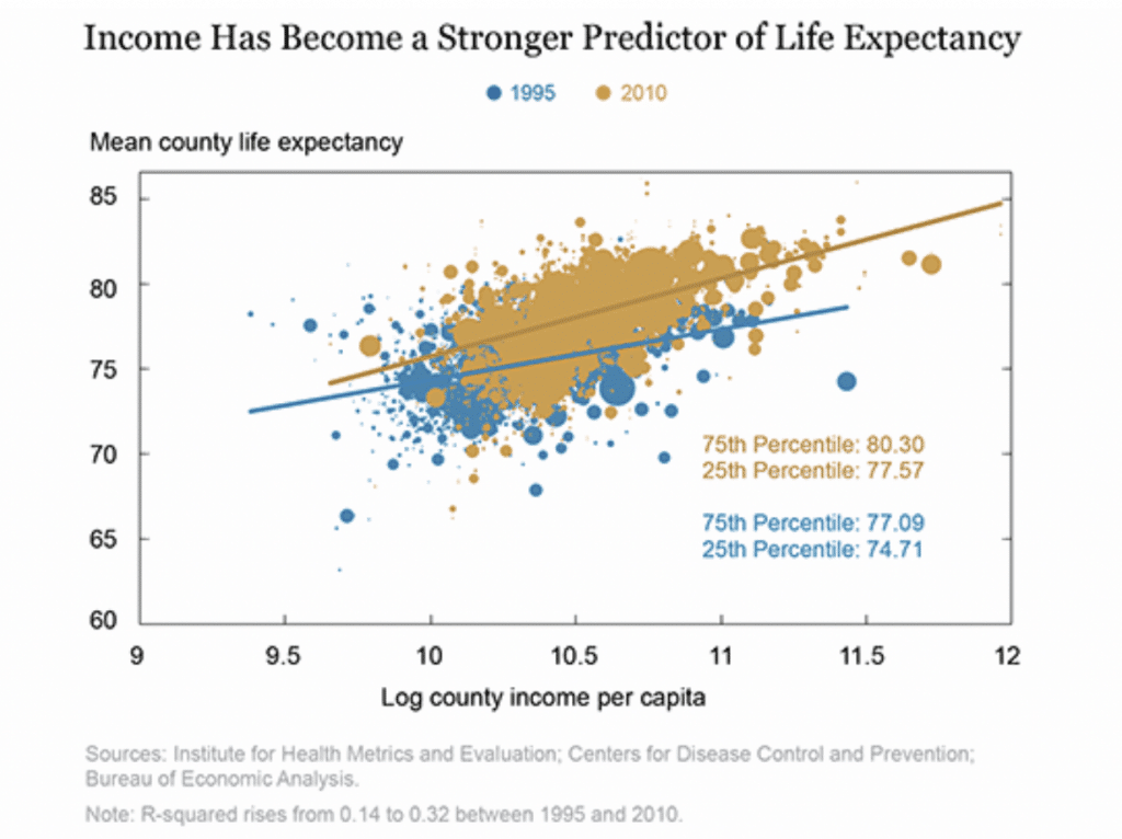
We see that county life expectancy is much more closely related to county personal income in 2010 than it was in 1995. It is immediately obvious that the organic line is steeper than the blue line; life expectancy is more correlated with income in 2010 than it was in 1995.
A 10 percent increase in county income was associated with an increase in average life expectancy in 1995 of three and a half months versus an increase of five and a half months in 2010.
One may conclude the correlation the chart plots is causal –having a high income is now more important to accessing quality medical care, which in turn prolongs life. However, measures of access to health care, such as the fraction of poor people who have insurance, or the provision of preventive care, are not correlated with the life expectancy of the poor, and neither are measures of a county’s economic health, such as its unemployment rate.
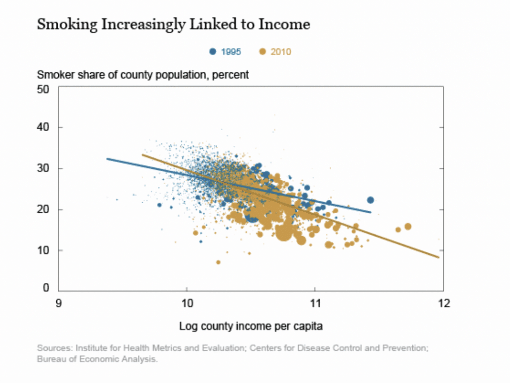
In fact, the strengthening of the relationship between county life expectancy and county income in the United States can be statistically explained by the smoking rate. The Fed study used U.S. smoking prevalence by county from 1995 to 2010 from IHME. The next chart shows that the relationship between smoking prevalence and income across U.S. counties has become stronger over time, mirroring the relationship between life expectancy and income. Not only did the smoking rate in the United States decline, on average, over these fifteen years, but it declined much more in high-income places than in low-income places.
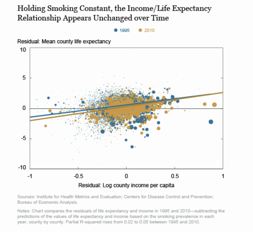
Finally, the last chart compares life expectancy and income in 1995 and 2010—subtracting the predictions of the values of life expectancy and income based on the smoking prevalence in each year, county by county. Now, the two scatterplots are right on top of each other, and the lines of best fit through them—the relationships between life expectancy and income, controlling for smoking prevalence, in 1995 and in 2010—are nearly identical. In fact, controlling for the changes to smoking prevalence, income explains nearly the same share of the cross-county variation in average life expectancy in 2010 as it did in 1995. The strengthening of the relationship between income and life expectancy that we observed before can be explained entirely by the intensification of the relationship between income and smoking prevalence
A promising approach to reducing life expectancy inequality would be to reduce adverse health behaviors formerly widespread but now increasingly concentrated among the poor. Figuring out how to do this will be the key to reducing health inequality.
SOURCE