This is the second post of our three-part series on the impact of COVID-19 on economic inequality during 2020. Last week we looked at how workers across distinct, wage-earning groups fared, during both the early stages of the economic meltdown, and the subsequent recovery period.
Today, we take a look at the inequality story through a different lens. Specifically, what were the economic and racial differences between those who had to continue working away from home (i.e. commuting), versus those could work from home.
In the early stages of the pandemic, we saw the workplace being impacted by a combination of governmental policies, such as shelter-in-place, and voluntary actions. Numerous states went into significant levels of lockdown, essentially resulting in three categories of workers:
- Those who could work remotely from a home office, which were typically business professionals like programmers, accountants, marketing executives, etc.
- Those who had to work on-site for “essential businesses“ which ranged from workers in healthcare to construction to agriculture, to name a few.
- Those who worked in industries/occupations that were, to a large extent, shut down, notably hospitality, leisure and restaurants.
As we have been documenting for nearly a year in ECONOMETRIX, RDS’s Tableau Public data visualization series, this third group of workers disproportionately bore the brunt of the economic crisis precipitated by COVID-19. By April, unemployment in food service, for example, surpassed a staggering 40 percent. And, of course, in LAST WEEK’S POST, we detailed how those types of service occupations, in particular, are populated by low-wage workers who, for the most part, did not experience the same recovery as other wage-earning groups.
Again, in this post, we are pulling from a recent analysis published by the New York Federal Reserve’s Liberty Street Economics (LSE) group.
METHODOLOGY
To determine differences in commuting patterns, LSE employed aggregated and anonymized cell-phone mobility data from SafeGraph. So, for example, they were able to identify two groups using county-level cell-phone mobility:
- Full-time workers: A device leaves home at 8AM on weekdays, goes to the same location, and returns home at 6PM.
- Part-time workers: A device that is seen to spend 3-4 hours during the workday at a location other than home.
They then used this data to identify the work-from-home and commuting-to-work patterns, before and after the start of the pandemic.
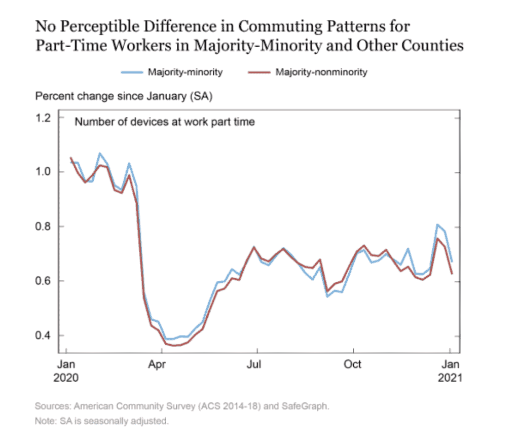
Finally, the LSE report looked at part-time commuting by race. As you see from the chart below, there is no perceptible difference the commuting patterns between MM and non-MM workers throughout the entirety of 2020.
INCOME AND COMMUTING DIFFERENCES
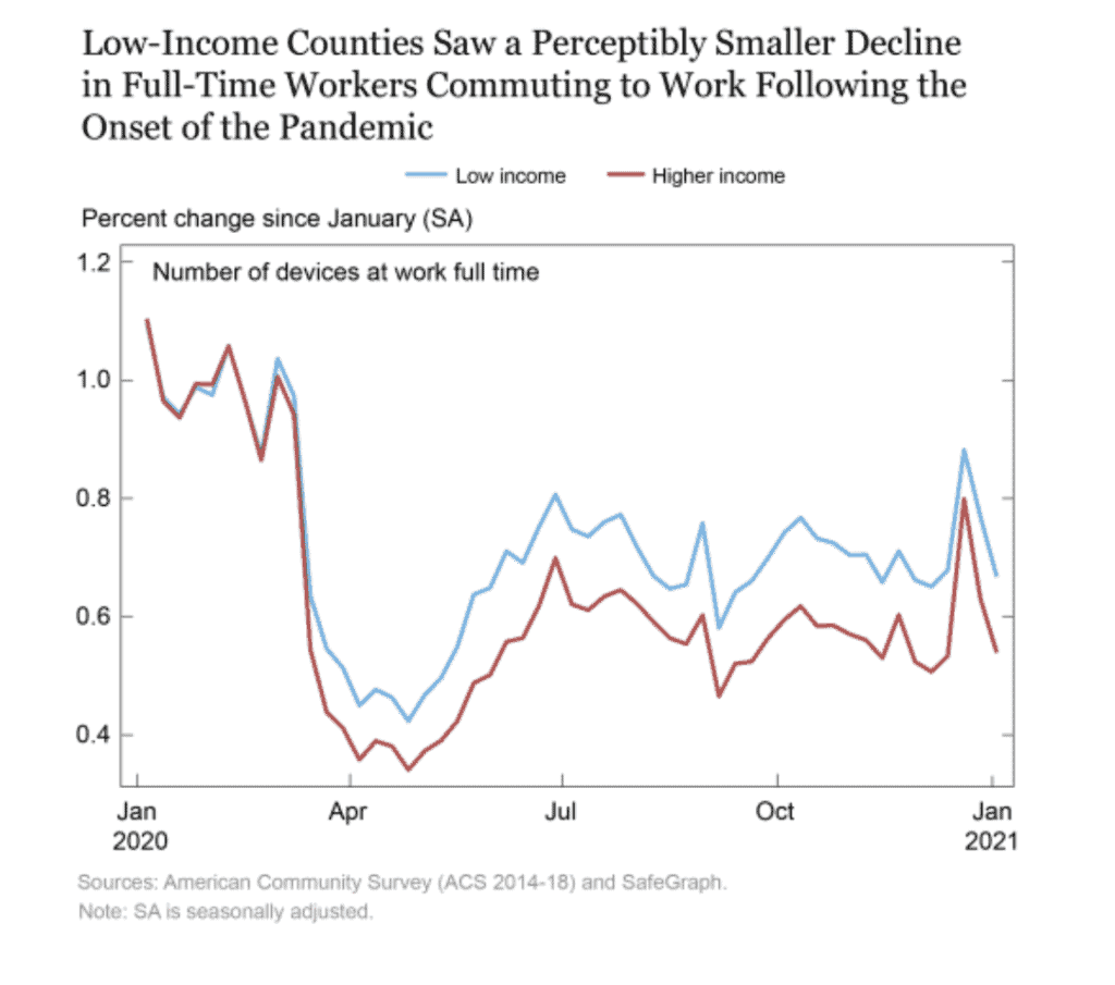
The first graph below tracks commuting differences by income levels for full-time workers between January 1, 2020 and January 31, 2021. As you can see, pre-pandemic, there is no difference in the number of devices at work full-time between lower and upper income workers.
Of course, the story changes in March as states began to implement shelter-in-place mandates. We see a dramatic decline in all devices going to work starting about March 15. But the decline is much more pronounced for higher income workers, suggesting they have much great flexibility to work from home. This work-from-home gap between upper and lower income groups remained consistent throughout 2020, into 2021.
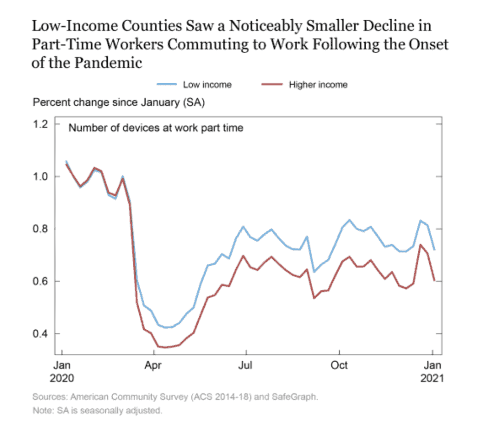
The graph below looks at the story with regard to those identified as part-time workers. Again, we see a similar pattern, with no difference in commuting pre-pandemic, ad a steep decline beginning in mid-March. Still, comparatively speaking, upper income workers, even those doing part-time work, commute less (i.e. work from home more) than their lower-income counterparts.
RACE AND COMMUTING DIFFERENCES
In addition to income differences, the LSE study looked at differences in commuting in terms of race.
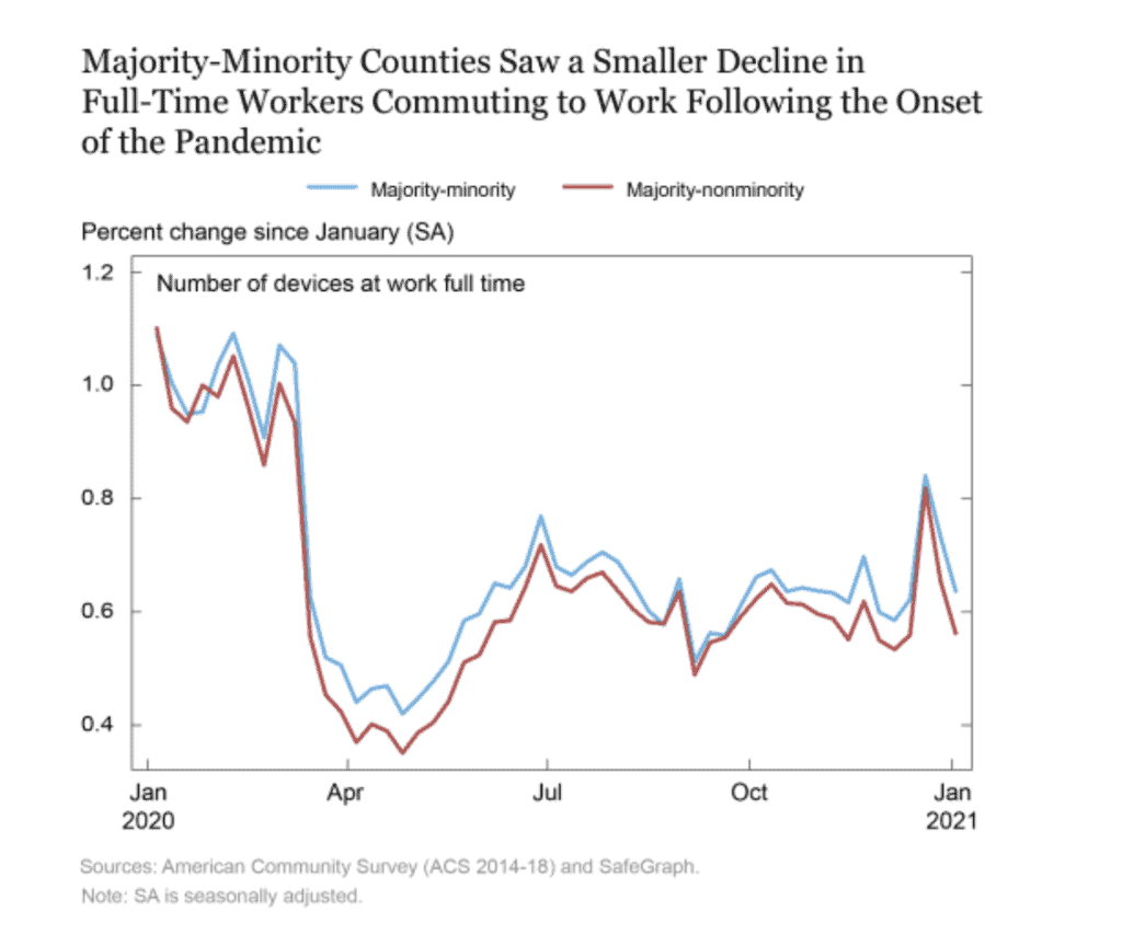
The graph below looks at the relationship between race and commuting with regard to full-time work. Note, that pre-pandemic, there was already a commuting gap between full-time workers who are from majority-minority (MM) counties and non-MM counties.
As we saw with the income analysis above, once COVID restrictions began to kick in, there was precipitous decline in commuting for both MM and non-MM workers, with no gap between the two groups. The commuting gap begins to form in April, showing that workers from MM counties were returning to a formal workplace in greater numbers than non-MM workers.
Finally, the LSE report looked at part-time commuting by race. As you see from the chart below, there is no perceptible difference the commuting patterns between MM and non-MM workers throughout the entirety of 2020.
This analysis clearly shows that those workers in lower-income Black/Hispanic-majority counties were much less able to substitute work-at-home for work-away-from-home. This, of course, might explain why these demographic groups had higher incidences of COVID cases than the general population.
In our next post in this series, we look at how Black and White workers moved between unemployment and employment, as the 2020 economic recovery started to take hold.
SOURCE
To learn more about Recovery Decision Science contact:
Kacey Rask : Vice-President, Portfolio Servicing
[email protected] / 513.489.8877, ext. 261